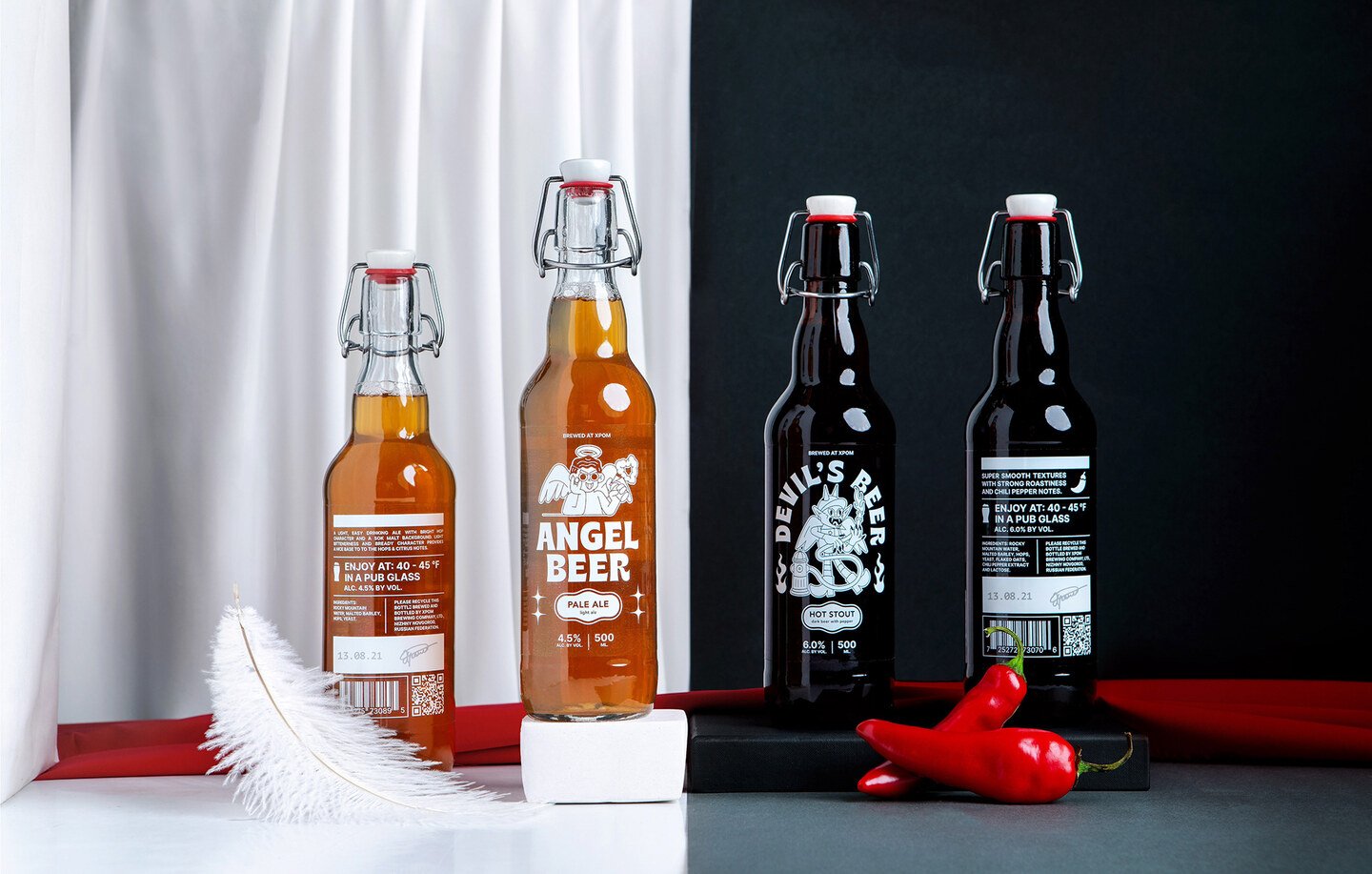
Brewed at XPOM
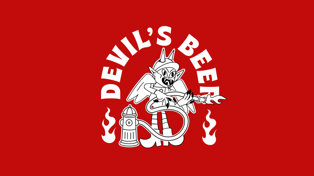
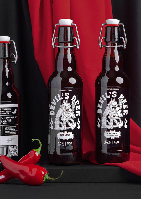
Label concept for limited edition craft beer. The idea is based on the division of beer varieties into light and dark, like the confrontation between the Angel and the Devil. «Angel beer» — Pale Ale, for those who choose the bright side. «Devil’s beer» — Hot Staut with pepper for lovers of spicy dark.
Collaboration between Chrome Studio and Costa Rican illustrator Anthony Orozco. In his work, Anthony focuses on experimentation in creating unique character designs. He also loves typefaces and combines them with illustration, explores space and composition while keeping the color palette as reduced as possible. As part of the project, the color in the labels was completely removed and the line was divided due to the color of the beer. And the shape of the bottle with a lock-cap emphasizes the craftiness of the line.
And which side will you choose?