ОТР identity

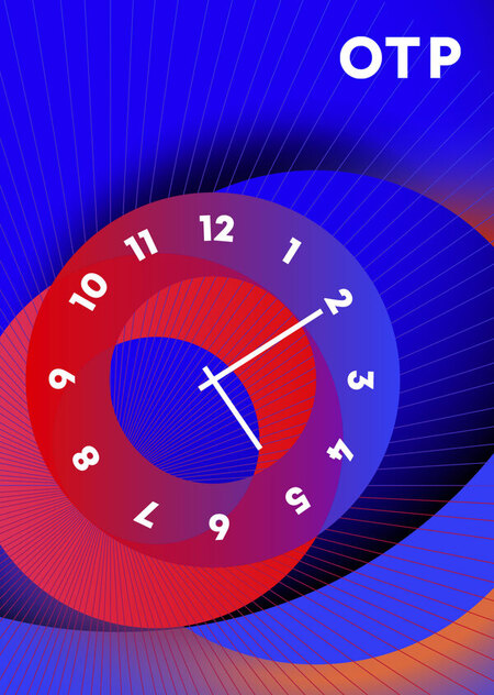
Branding for the OTR TV channel. The basis of the brand system is the method of creating geometric patterns using two luminant circles. These circles mean enlightment and give a reference to the planet image. The patterns are formed of two spheres combined into different geometrical compositions.
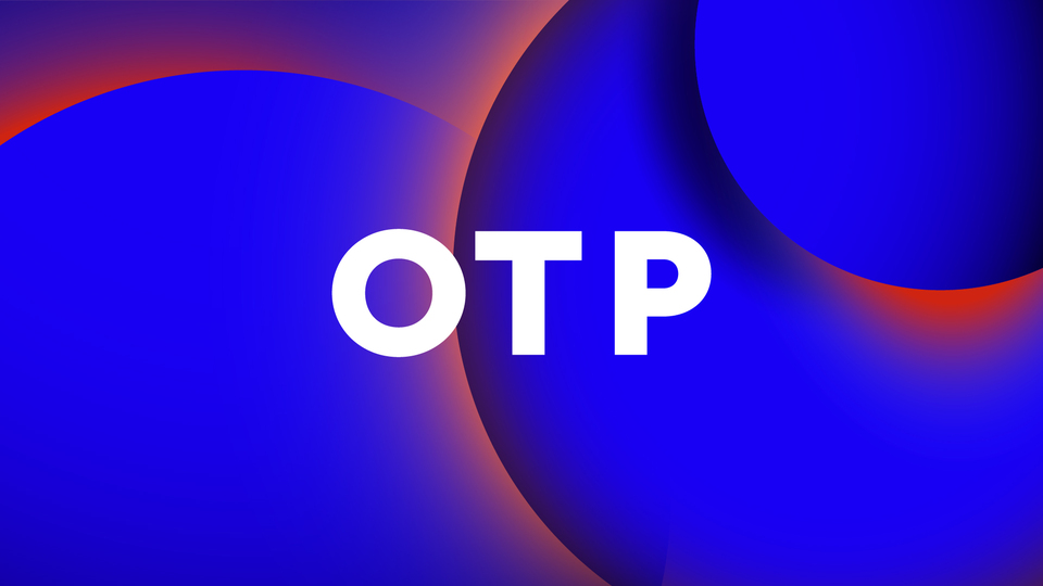


The typographic development of the identity consists of the simple typographic spelling of the logotype. The first letter ‘O’ in the TV channel name is the main character of the identity. It can be a container, can mean the main part inside the program, can act as a separate object.
The sound identity variants for the OTR logotype are prepared by the sound design laboratory of the HSE Art& Design School.
The variants of the clock animation are prepared by Vasily Shikhachevskiy.