Elena Stromcurated byLeonid Slavin
Original size 1239x1752
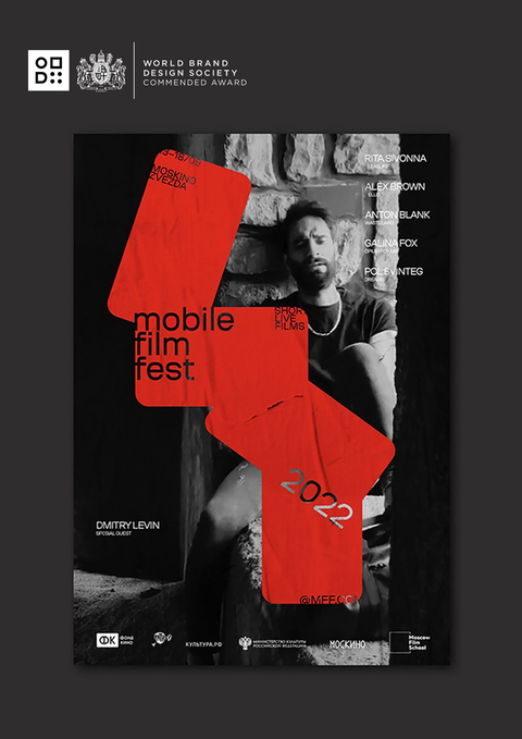
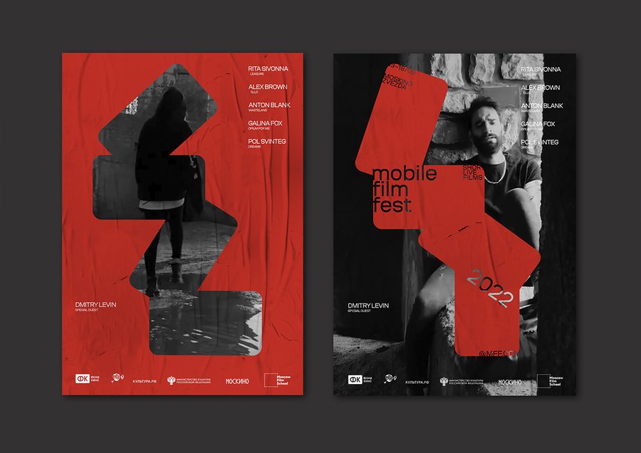
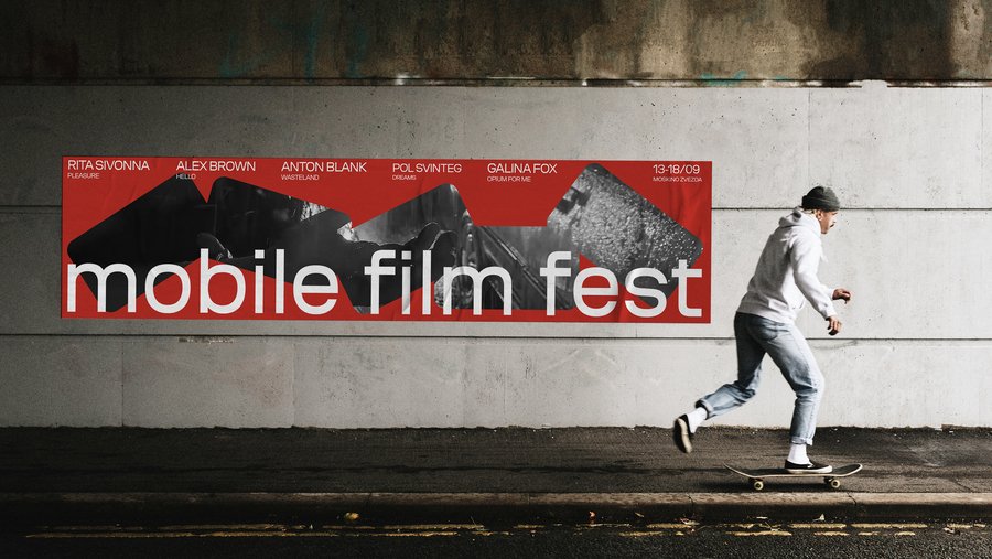
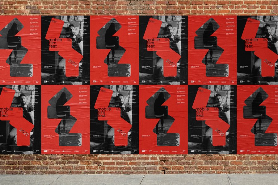
Brand Identity for Mobile Film Fest
When shooting with a cell phone, we constantly have to turn it to find the best angle. By taking several identical silhouettes of cell phones and trying different ways of layering them on top of each other, I found that new bizarre shapes appeared. The resulting images became the basis of the festival project’s identity. These forms have a variability of combinations, which is very convenient when applied to different surfaces. I chose red as the color for the project, as it corresponds to the color of the record button on the phone. And the frames from real mobile movies became the perfect background and addition to the logo. For this project, I used the Coil font from Brownfox.
Original size 3508x2480
Original size 2763x1555
Original size 2400x1600
Original size 2125x1417
Original size 4679x3308
Original size 3509x2481
Original size 3509x2481
We use cookies to improve the operation of the website and to enhance its usability. More detailed information on the use of cookies can be fo...
Show more