The Number of Intentional Rest — Lending

Problem

Decision
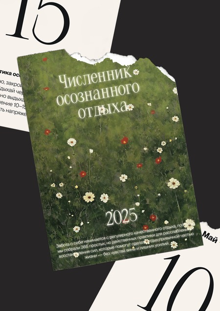
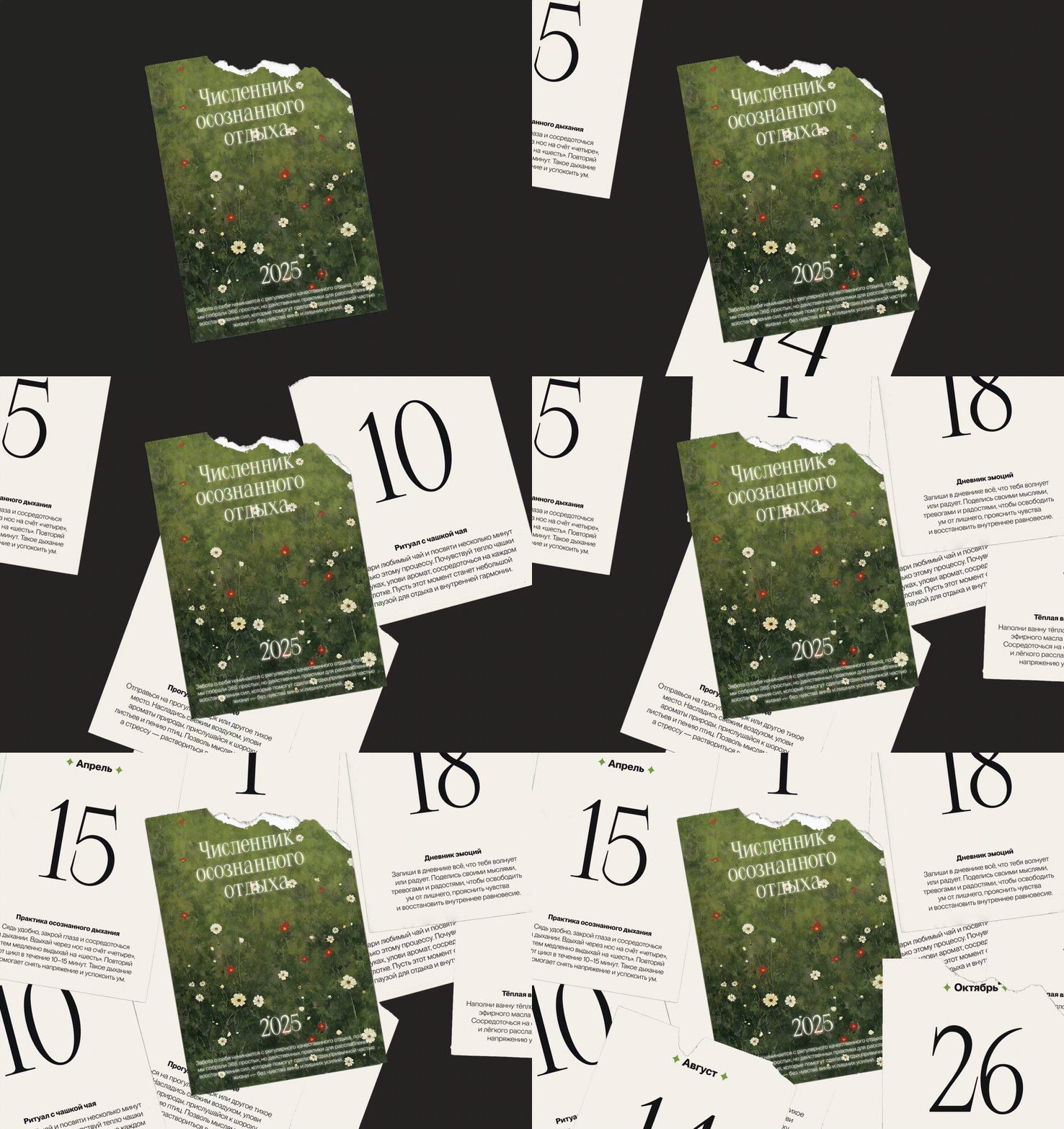
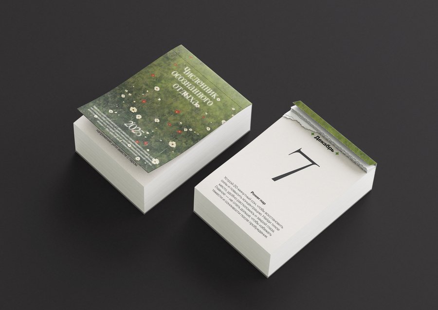
A number of conscious vacations are a calendar of short but effective practices for relaxing and rejuvenating each day, which will help create a habit of caring for themselves and building regular rest into everyday life.

Landing
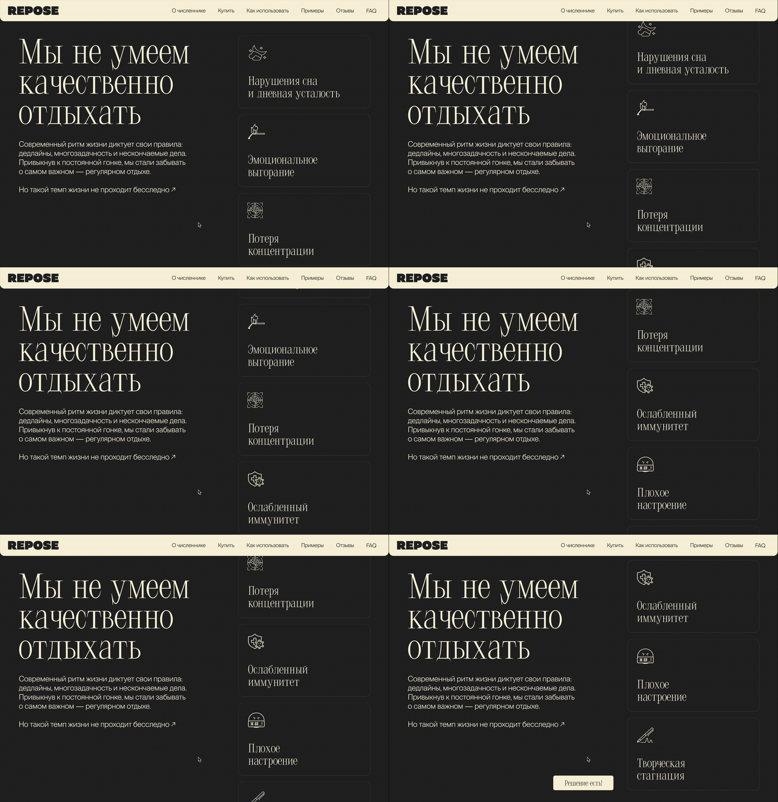
Visual style conveys an atmosphere of calm and recovery, highlighting the key idea of a conscious approach to recreation. The elegant Lithium Typeface font adds fineness and ease and draws attention to headlines and accents, while the neutral and modern grotesque PP Neue Montreal provides good readability and balances visual aesthetics.
The color palette complements the concept of naturality and peace. The engraving from light beige to muffled green resembles natural elements and causes associations with recovery and internal balance. Deep dark grey adds contrast and depth, helping to highlight the key elements of the interface while maintaining restraint and minimalism, and soft beige creates a calm and warm atmosphere.
Landing’s design highlights the idea of simplicity and accessibility: a minimalist design with a clear division of sections and an emphasis on visual elements reinforces the perception of the main message, and the pages with tasks are intuitive and visually attractive, highlighting the idea of a gradual approach to recreation. The ease and harmony of visual style shape positive associations and make the product not only understandable but also aesthetically pleasant.