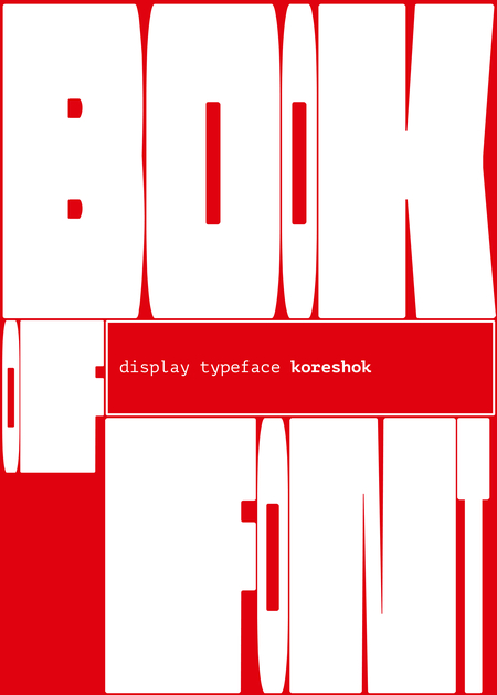
koreshok — новый вариативный акцидентный шрифт, сочетающий геометрию и плавность, имеет характерную вытянутую форму, а так же узкие и широкие варианты литер.
Хорошо подходит для заголовков и крупного начертания. Представлен для латиницы и кириллицы.
Исходный размер 3418x1986
Шрифт вдохновлен геометрией книжной полки, когда книги стоят плотно друг к другу. Так как книги не бывают одинаковой толщины, то и буквы сделаны в двух вариантах — узкие и широкие. Каждая литера стремится вписаться в прямоугольник, но имеет скругленные углы, как у старых, уже ни раз прочитанных книг
Исходный размер 3418x1986
Исходный размер 3418x1986
Исходный размер 3418x1986
Исходный размер 3418x1682
Кириллица узкая
Исходный размер 3418x1682
Кириллица широкая
Исходный размер 3418x1682
Латиница узкая
Исходный размер 3418x1682
Исходный размер 3441x2428
Цифры
Исходный размер 3441x1001
Другие символы
Исходный размер 1991x1120
Исходный размер 2480x1750
Исходный размер 2480x1750
Исходный размер 2480x1750
Исходный размер 2480x1750
Исходный размер 3441x2428
Исходный размер 3441x2428
Исходный размер 3441x2428
Исходный размер 3441x2428
Исходный размер 3441x2428
Исходный размер 3441x2428
Исходный размер 3441x2098
Исходный размер 2480x1750
Исходный размер 3441x1064