Original size 1496x2100
Touch&grow Baby Eagle
Longread translated automatically
The project is taking part in the competition

Original size 4271x2846
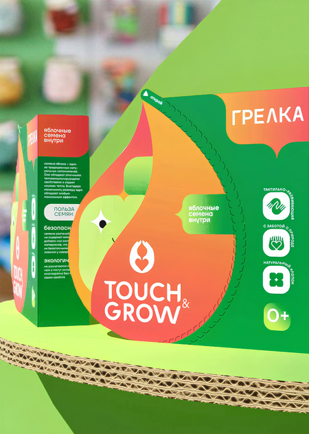
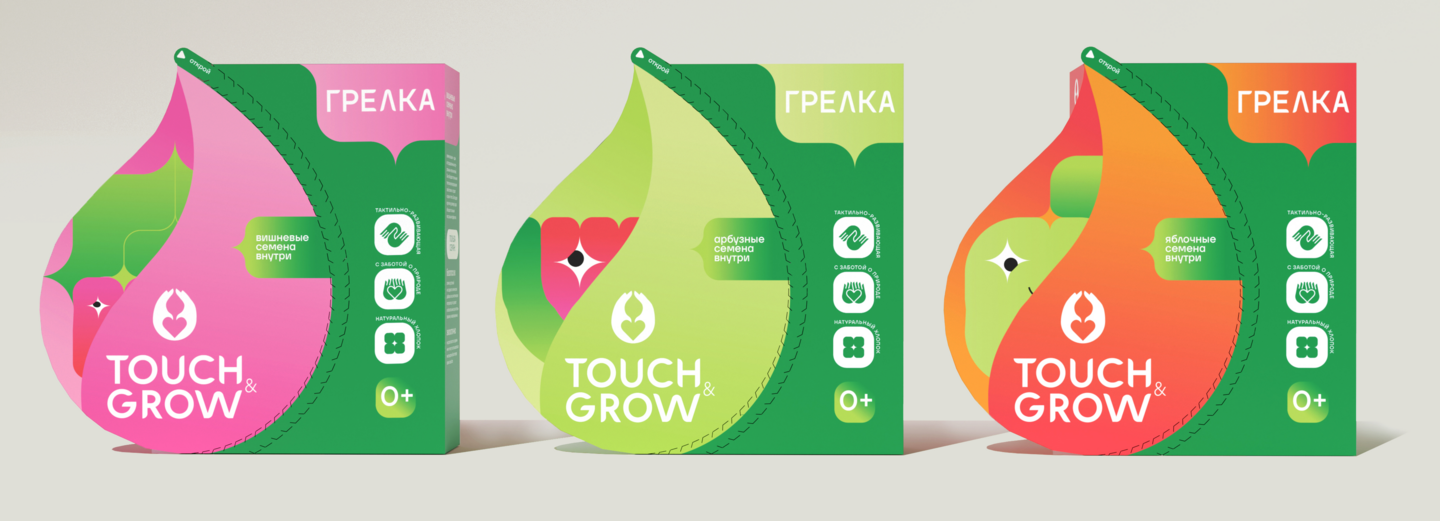
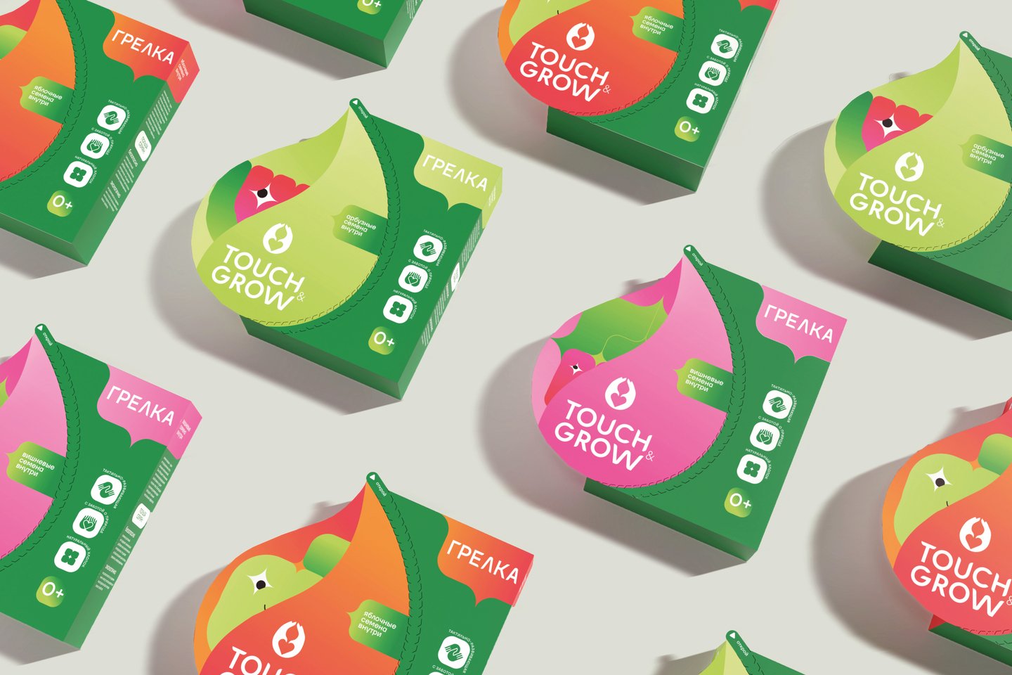
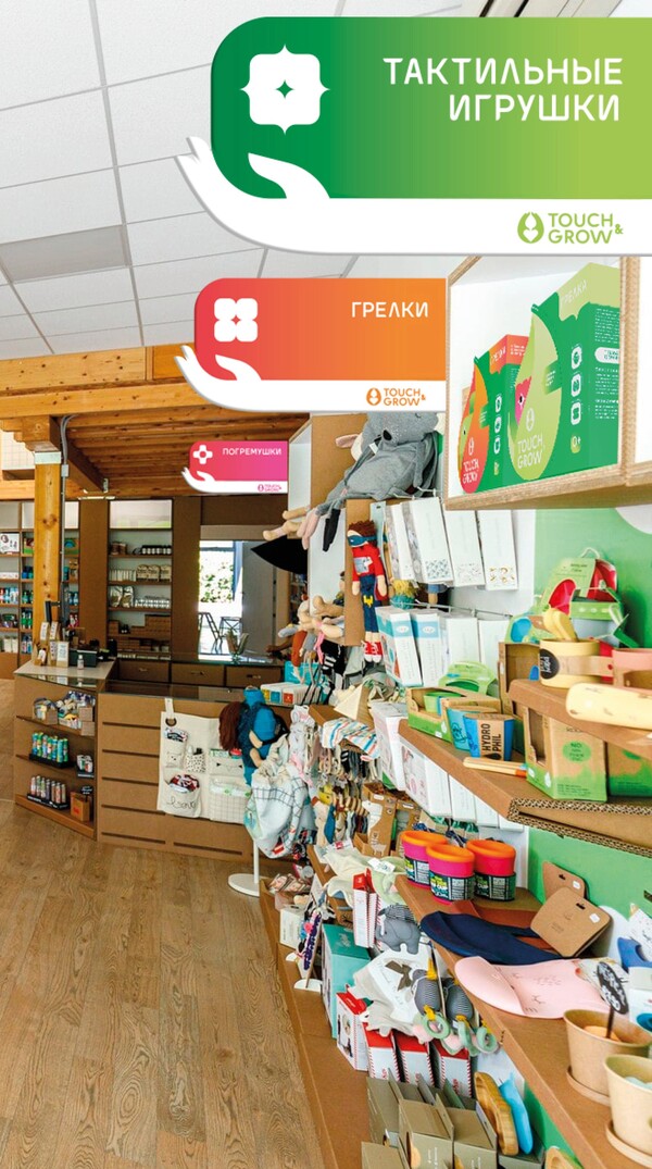
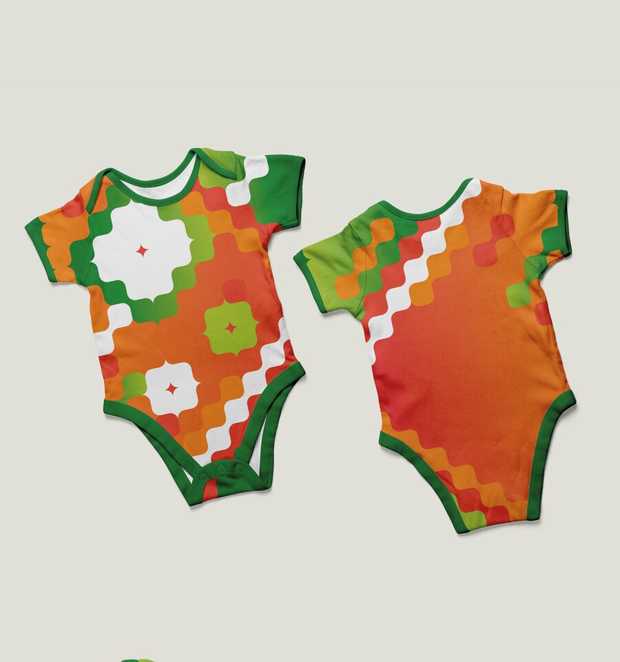
The goal is to create a visually attractive and functional package that takes into account the safety and comfort needs of caring parents. A comprehensive brand style has been developed, including a logo, graphics and a package with three SKU (shirt, apple, watermelon). The colours used are bright, in contrast to the pastive decisions of competitors, which target conscious parents who reject «run» stereotypes. The perforation package is involved in the opening process, and the shape increases the design area in the front without compromising transportation. POS materials provide effective presentation and tactile testers for product quality.
Original size 4100x1483
Original size 4271x2846
Original size 4271x2846
Original size 4271x2846
Original size 4271x2846
Original size 4271x2846
Original size 4271x2846
Original size 4271x2846
Original size 1800x608
Original size 4271x2846
Original size 4271x2846
Original size 4271x2846
Original size 4271x2846
Original size 4271x2846
Loading...
We use cookies to improve the operation of the website and to enhance its usability. More detailed information on the use of cookies can be fo...
Show more