Anna Prischepacurated byNatalya Burdenkova
Original size 1240x1750

Ice-chilled lollipops
Longread translated automatically
The ice cream is a candy brand with a cold effect from the berries of the Arkhangel forest.

Original size 1500x843
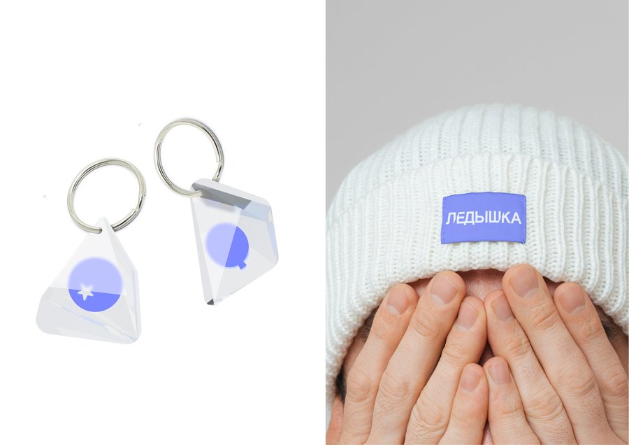
The branding was based on the metaphor of caramel as ice. Visual communication is complemented by 3d pictures of lollipops and vectoric images of Russian berries that break down. Logo and typography use the refractory of letters over ice

Original size 1500x431

Original size 2502x1768
Original size 1248x702
Original size 2480x1750
Original size 2502x1768
Original size 1500x843
By refracting printing, an illusion of an invisible icebox is created.
Original size 2480x1750
Original size 2480x1750
Original size 2480x1750
Original size 2501x946
Original size 2480x1750
Original size 2480x1750
Original size 2502x1768
Original size 3056x2160
Original size 2480x1750
Original size 2480x1750
Original size 1500x843
Original size 2480x1750
Original size 2502x1768
Original size 3050x2160
Original size 2480x1750
Original size 2480x1750
We use cookies to improve the operation of the website and to enhance its usability. More detailed information on the use of cookies can be fo...
Show more